Upskilling in Data Visualization for Interviews
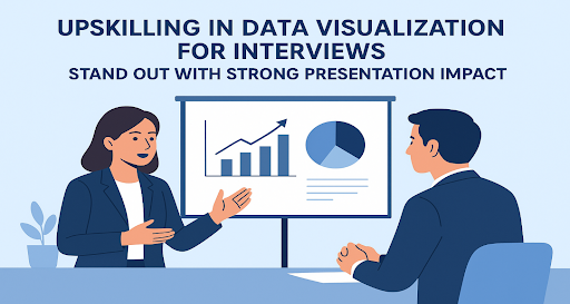
Table of Contents
Introduction
Learn the Basics of Data Visualization Tools
Understand the Storytelling Side of Data
Practice Simplifying Complex Data
Focus on Design Principles
Use Real Interview Practice Scenarios
Collect Feedback on Your Visuals
Stay Updated with Trends in Data Visualization
Conclusion
- FAQs
References
7 Powerful Ways to Upskill in Data Visualization for Interviews
Introduction
In today’s job field, knowing how to show data clearly is a big career benefit. Hiring people want candidates who can change hard numbers into a clear understanding. This is why data visualization for interviews is very important. Whether you apply for a business analyst job, a marketing job, or a research job, being good at data visualization for interviews can make you different from others. The good thing is that you can improve this skill with useful steps, and it will also increase your presentation impact, making your showing stronger.
1. Learn the Basics of Data Visualization Tools
Start with commonly used tools like Microsoft Excel, Power BI, or Tableau. These tools are easy for new learners and often come with free versions or free trial time. Once you feel comfortable with the basics, try making reports with charts using actual data. In interviews, being able to showcase that you’ve practised with actual tools instantly adds credibility to your data visualization for interviews skills.
2. Understand the Storytelling Side of Data
Data alone won’t impress recruiters unless you can explain it clearly. Explaining with stories is the skill of helping your listeners understand the numbers. Instead of saying, “Sales went down by 10%,” say, “The 10% sales drop in Q3 shows the need for stronger marketing plans.” This storytelling approach strengthens data visualization for interviews and makes your explanation easier to remember.
3. Practice Simplifying Complex Data
One of the biggest mistakes job seekers make is filling charts with too much data. Interviewers want a clear understanding, not mixed-up information. Use simple pictures like bar charts, line graphs, or pie charts instead of difficult designs. A strong skill in data visualization for interviews means knowing how to highlight the most important point without overwhelming the audience.
4. Focus on Design Principles
A good showing of data is not only about numbers but also about look and style. Focus on colours, fonts, and spacing. For example, use different colours to highlight key numbers and avoid a mess. Clean design makes it easy to read and improves the effect of your presentation during interviews. Even if your content is strong, poor design can make the final image weak.
5. Use Real Interview Practice Scenarios
A practical way to upskill is by creating mock interview tasks for yourself. For instance, take a company’s annual report and convert the raw data into visuals. Then, prepare a short explanation as if you’re presenting to an interviewer. This exercise strengthens both your analytical thinking and your data visualization for interviews skills, while also making you more confident when the real moment comes.
6. Collect Feedback on Your Visuals
Show your charts and dashboards to friends, guides, or work partners. Ask them if the charts or pictures are clear at first glance. If they take too long to understand your chart, it means you need to make it easier. This process helps you improve your work and makes the effect of your presentation better, which is key for strong data visualization for interviews.
7. Stay Updated with Trends in Data Visualization
Data is always changing, with new tools, ways, and designs coming every year. For example, pictures that explain data, reports where you can click and see more, and live data charts are becoming more liked. Keeping yourself current makes sure your data visualization for interviews stays useful and strong in the job market.
Conclusion
Improving your skill in data visualization for interviews is not only about learning a tool—it is about learning how to share clearly with data. Strong skills can help you stand out by showing that you are not only good with tools but also someone who explains well. When you mix storytelling, simple style steps, and actual practice, you make your showing better and give interviewers a lasting memory. Remember, in today’s competitive job market, it is not only about what you know but about how well you can show it.
FAQs
Q1. Why is data visualization important for interviews?
Data visualization helps candidates present complex information clearly, making it easier for recruiters to understand insights. It also demonstrates analytical, communication, and presentation skills.
Q2. Which data visualization tools should I learn first?
Start with beginner-friendly tools like Microsoft Excel, Power BI, or Tableau. These platforms are widely used and provide free versions or trial periods to practice.
Q3. How can storytelling improve presentation impact?
Storytelling turns raw numbers into meaningful insights. For example, instead of just showing a sales drop, explaining its impact on strategy creates a stronger connection with the interviewer.
Q4. What are common mistakes to avoid in data visualization?
Avoid overloading charts with too much information, using unclear design choices, or neglecting color and spacing. Simplicity and clarity should always be the goal.
Q5. How can I practice data visualization for interviews?
Use real-world scenarios like annual reports or market data, convert them into visuals, and practice explaining them as if in an interview setting. Collect feedback to refine your presentation impact.
Q6. How do I stay updated on data visualization trends?
Follow industry blogs, take online courses, and explore updates in popular tools like Tableau or Power BI. Trends like interactive dashboards and real-time data visualizations are increasingly valued.
References
[1] “Introduction to Data Visualization,” Tableau Public, 2024. [Online]. Available: https://public.tableau.com/
[2] “The Power of Effective Data Storytelling,” Harvard Business Review, 2023. [Online]. Available: https://hbr.org/
Penned by Anjum Mulani
Edited by Shashank Khandelwal, Research Analyst
For any feedback mail us at [email protected]
Streamline Your Hiring with Eve Placement’s Custom Assessments
Eve Placement helps you engage, assess, and recruit top talent through tailored hiring challenges that go beyond resumes. From technical quizzes and real-world case studies to psychometric evaluations and audio/video submissions, our platform enables smarter, data-driven hiring decisions. Advanced security features ensure authenticity and eliminate fraud, giving you reliable results. Ready to hire better? Know More.
Mail us at [email protected]